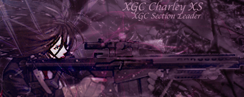
Making some improvements for sure. Your text is still kind of rough though, because it doesn't have any effects on it. You want the text to not be so distracting on your sig and you want it to blend in. Play around with blend modes and layer styles. Keep the text small.
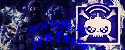
Effects wise, making progress but you also need to consider flow.
The red lines mark a flow that I would have gone with. Since your render has no flow to it, usually you'll end up with this direction. You want to make your effects move in that direction.
Also there is lighting to consider. On your render, the light comes from the left side, so you want to add a light source (big soft brush maybe 300-450px, white) and then darken all the shadows to make it pop more. The yellow is where the effects should fade out and it should get darker, because its farther away from the light.