Welcome to Xiled Gaming
Wanting to join the rest of our members? Feel free to sign up today.
Sign Up Now

NOOO ITS YETI APPLICATION

Jupiter

XG CONTRIBUTER
Jul 18, 2010
6,590
36
0
32
Tucson, Arizona
xgckoneko.deviantart.com
For the Red XDC Awakening one, I don't have a clue what is going on. The text catches my eye before anything else does, your render is kinda hiding off to the side. Aside from that, you have no depth. When using brushes, try to work with a color that is pulled from your render/focal. When you use a color that doesn't match anything it makes the entire thing look messy. Another thing when using brushes or any effects is you need to keep a flow going. Everything is just going in random directions on this sig.


Try resizing your render (follow the rule of thirds), decreasing the size of your text and even try changing the color & font as its hard to read.


For the willie nelson one, I feel like he is being taken over by pink smoke. Aside from that, you have a grey render in the middle of a rainbow colored image.. It helps him stand out but at the same time he looks really out of place. Also, he doesnt look blended in whatsoever.. I can see every single edge of the render you used.

For the hellfire one, its a lot less hectic which is nice. You do still want to work on your depth. Again, the text is a bit too large and is taking away from your focal. The colors on this one are much better however.

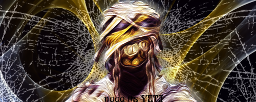
For the mummy one, the focal does alright in the center but having your focal in the center make its hard to place text because anywhere you put it will be either off balance or smack dab on top of your render. I do like the effects used.. Theyre hectic but it sort of works with the mummy theme. The colors could be better. Try working with gradient maps to help even the tone of your signatures.
 

nooo its YETI

Forum Veteran
Mar 22, 2012
351
0
0
34
Worcester, MA
aleingodess_by_bumoftastreet-d7ulrfl.png


here is another I did today. trying to put into practice what a community for Sig designs has been helping me learn and put into practice.
 

VenerealMonkey

XG CONTRIBUTER
Mar 10, 2012
4,142
15
0
42
Little Rock, AR
mummie_by_bumoftastreet-d7ub5y3.png


Okay so I had my Lt. pick a random render/picture for me to use in a sig and he gave me the Iron Maiden mummie. This is what I did with it. Also please I would like to get critiques on the ones I have posted recently. I know people are busy but I feel like I might be wasting my time applying as no1 is responding to the post I make and I know two of the people on the design team cant as they are my general and my old general so it would seem bias. But please critique me I am not going to get any better if no1 tells me what i should be working on.
There is NO bias on the Design Team yeti. Any designer can CnC an app's work, and it is more beneficial to have multiple eyes reviewing. But ultimately, the approval lies with myself and Jupiter on who gets accepted in and who still needs training.

Yes it is a daunting process, heck mine took 5 months and 14 designs remade 5+ times each to be accepted, but it's worth it in the end. The best tool I had was other people's works. I would look at the sigs other Designers had made and focused on what I was missing compared to theirs. That and tutorials, tutorials, tutorials. I still view them from time to time to learn more and develop new techniques. The critique you get here is very helpful and goes a long way, but you need to do research and practice on your own.

Hope my wisdom helps in some way. Happy designing....
 

nooo its YETI

Forum Veteran
Mar 22, 2012
351
0
0
34
Worcester, MA
funkyfishman_by_bumoftastreet-d7utt1z.png

entered this into a VOTW on a sig website the theme was FUNKY.
fatheoftime_by_bumoftastreet-d7ut4yq.png

just something I did for the heck of it
aleingodess_by_bumoftastreet-d7ulrfl.png

re-worked the old one and added some color so the render stuck out more..no floating head syndrome(yes that is the real neck in the render).


I apologize for the delay in between posts. Things have been going on in our clan and that is where my focus is right now. I have been working on sigs but figured I would give you these three as they are my legit ones and not my goof off ones or style practice sigs.. Have been working on animation sigs but still trying to get the hang of that. Hope you like these and also starting to see the improvement from when I first started to now. look forward to comments on these.
 

Jupiter

XG CONTRIBUTER
Jul 18, 2010
6,590
36
0
32
Tucson, Arizona
xgckoneko.deviantart.com
Not a problem. The thing im seeing with your sigs is a lack of good depth still. The tops one of the last 3 is cluttered but it wouldnt be so bad if you had some depth Right now everything is the same focus and it just looks a mess. I do like the second one, its a fun random sig and im assuming you went for the text to be the focal. The third one has nice effects but definitely needs some work on the depth. I have seen a nice improvement from you however so keep up the good work!
 

TheRealMrNUGGET

XG CONTRIBUTER
Jun 4, 2014
1,672
1
0
New England, US
funkyfishman_by_bumoftastreet-d7utt1z.png

entered this into a VOTW on a sig website the theme was FUNKY.
fatheoftime_by_bumoftastreet-d7ut4yq.png

just something I did for the heck of it
aleingodess_by_bumoftastreet-d7ulrfl.png

re-worked the old one and added some color so the render stuck out more..no floating head syndrome(yes that is the real neck in the render).


I apologize for the delay in between posts. Things have been going on in our clan and that is where my focus is right now. I have been working on sigs but figured I would give you these three as they are my legit ones and not my goof off ones or style practice sigs.. Have been working on animation sigs but still trying to get the hang of that. Hope you like these and also starting to see the improvement from when I first started to now. look forward to comments on these.

any more work yet?