Welcome to Xiled Gaming
Wanting to join the rest of our members? Feel free to sign up today.
Sign Up Now
BANNER REQUESTS ARCHIVE 12/02/11 - 08/04/13
- Thread starter KoG Remix
- Start date
You are using an out of date browser. It may not display this or other websites correctly.
You should upgrade or use an alternative browser.
You should upgrade or use an alternative browser.
- Status
- Not open for further replies.
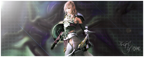
Shadowing is fine, just incorporate the render into the Sig. It looks like you made a background, then pasted the image on top. If you get a handle on blending, you'd be doing great.
Blending can be as simple as smudging the edges. It's to make it look like its part of the background and any action.
Blending can be as simple as smudging the edges. It's to make it look like its part of the background and any action.
that what i did with her, i smudged the entire outline....
here is another test image, i hope you dont mind i looked through a few
here is another test image, i hope you dont mind i looked through a few
No problem thats what theyre there for ^.^
the blending on the edges is much better
i would sharpen around her face though.
& the main issue here is you used such a large sig size, & the render is small compared to it which leaves tons of empty space to the left and right.
the text size is much better but in corners can be distracting. try placing your text near the render but never on your render if you can help it.
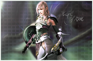
in a sense yes.
another way to work with a larger canvas is to either keep the render at a decent size to where it fills a good part of the canvas or to add multiple effects to fill negative space.
another way to work with a larger canvas is to either keep the render at a decent size to where it fills a good part of the canvas or to add multiple effects to fill negative space.
You're getting there! Huge improvement! Id prob try and scale her down, widen the Sig the way you had it, and add some different textures and such with clipping mask on both sides of her.
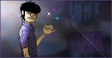
the lighting is right, the size and placement of the image is awesome. i like the colors. my only issue is its a bit plain and no blending was done for the render.
the lighting is right, the size and placement of the image is awesome. i like the colors. my only issue is its a bit plain and no blending was done for the render.
i completely understand, i just personally didnt want to take away from the fact of it being a cartoon character.
Added effects to fill in empty space doesn't take away from it being a cartoon area it will just make it more interesting and help blend/depth
test image
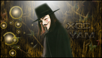
Try using a smaller brush to blend, you went pretty heavy on this one especially on hit hat. Background came out cool but colors are a little odd for the render you're using. And one of the orbs is cut off. Was that intentional?
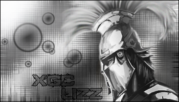
the blending and effects look nice but it needs more contrast. black & white sigs need to have a good variety of black to white shades included the blackest blacks and bright whites.
it looks good, but I'm not a fan of it's "style". the background doesn't match the render, if that makes sense
Sakura kiss - I def get what your saying, it was my first b&w and i was hesitant about going to bright or too dark, but i do see what areas could be brighter and darker. thanks
radio- i would comment but im not sure which one your talking about, but thanks, lol
radio- i would comment but im not sure which one your talking about, but thanks, lol
- Status
- Not open for further replies.