Welcome to Xiled Gaming
Wanting to join the rest of our members? Feel free to sign up today.
Sign Up Now
BANNER REQUESTS ARCHIVE 12/02/11 - 08/04/13
- Thread starter KoG Remix
- Start date
You are using an out of date browser. It may not display this or other websites correctly.
You should upgrade or use an alternative browser.
You should upgrade or use an alternative browser.
- Status
- Not open for further replies.
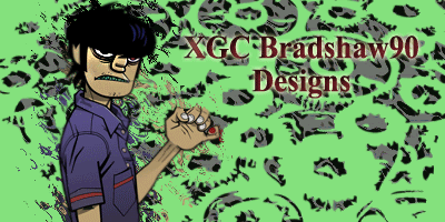
[PENDING] XGC BRADSHAW 90 APPLICATION
[PENDING] XGC Bradshaw 90 Application
1) XGC Bradshaw90
2) I am using Adobe Photoshop CS5 and Gimp 2.6
3) Ive been reading and watching tutorials and making signatures since October of 2011
4) I would like to first start off as a freelancer, just to have fun with it and still be able to stay in XGC DarkAges...but eventually, i will consider full-time
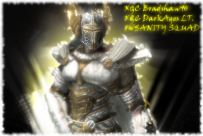
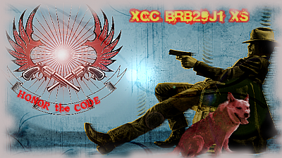
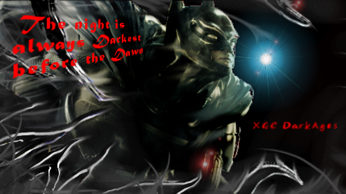
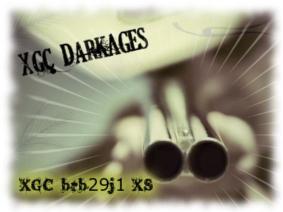
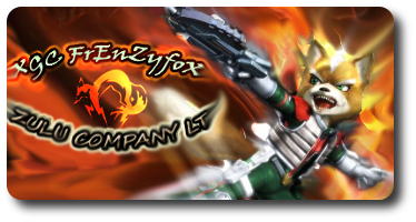
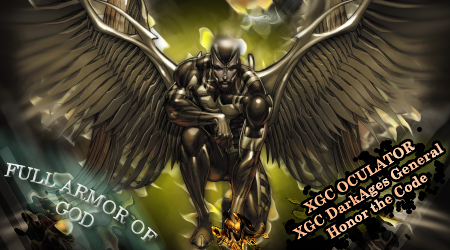
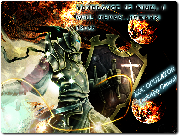
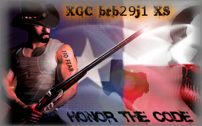
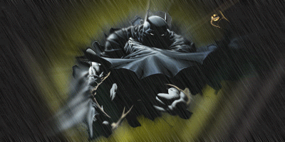
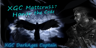
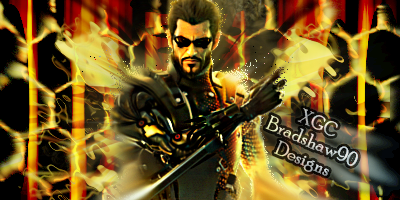
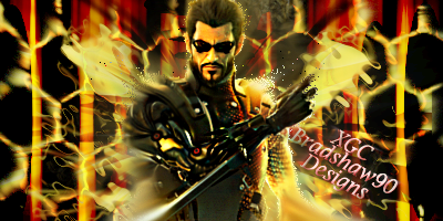
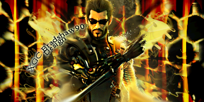
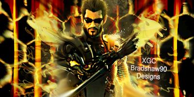
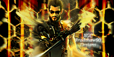
5) Submit as many works that you have done (try at least 5) = I am currently working on the test images and will have them posted for you, but so far this is what i have:

[PENDING] XGC Bradshaw 90 Application
1) XGC Bradshaw90
2) I am using Adobe Photoshop CS5 and Gimp 2.6
3) Ive been reading and watching tutorials and making signatures since October of 2011
4) I would like to first start off as a freelancer, just to have fun with it and still be able to stay in XGC DarkAges...but eventually, i will consider full-time
5) Submit as many works that you have done (try at least 5) = I am currently working on the test images and will have them posted for you, but so far this is what i have:
I also had these images CnC already in a different forum and so far i have taken everybody's advice and still practicing like crazy! Also, wanted to thank XGC Radioactive for encouraging to post my app and all the hard work he does ")
http://www.xiledgaming.com/forum/showthread.php?t=140746
http://www.xiledgaming.com/forum/showthread.php?t=140746
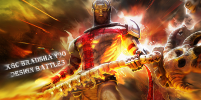
Some of the effects are cut off and throw off the flow
The right eye and top left
Other than that I like the sig
The right eye and top left
Other than that I like the sig
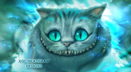
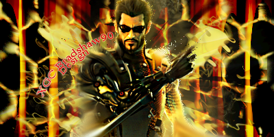
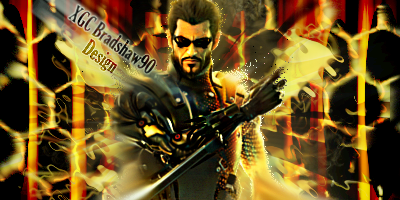
i took the bubble off of the eye and i blended the top left bubble, that look any better?
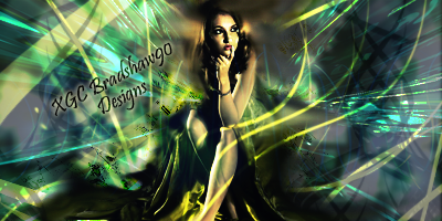
and heres the other one, not going to lie, had a real hard time with this one...real life pics are harder to use with the experience i have...any good tutorials or suggestions?

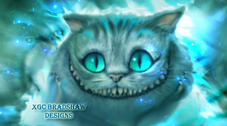
In the cat sig. It looks like you used tommyguns c4d. Just noticing. I think the eyes need sharpened.but then again I am looking from my phone.
i did! And i thank him for his hard work on those...are we not allowed to use them? If not, i wont use them anymore. I couldn't find any good c4d's and i saw his posting for downloads, so i figured i would give it a shot. Im not that great in applying them in the sigs, but still practicing. thanks for the advice!
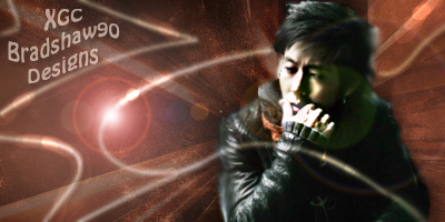
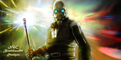
i definitely like the Cheshire cat one. i feel the cat is a tiny bit out of focus, maybe sharpen him some?? i think the second try of the asian guy is a ton better though you left some of a flare effect it looks like on top of him and its very distracting. also try to avoid placing text in corners as it can take attention away from the focal point. for the last one maybe use a different font? at that size that font gets condensed and is hard to read. i def like the rest though. i would suggest using a gradient map to tie all the colors together. you have an awesome start, keep up the good work!
Terrible, just terrible.you should remove your app.
Naw, you're doing good. He was just saying he was able to pick out tommys pack. You're more than welcome to use it. I'll send you a link for some great fractals and some free fonts.
Naw, you're doing good. He was just saying he was able to pick out tommys pack. You're more than welcome to use it. I'll send you a link for some great fractals and some free fonts.
haha wow dude...and thanks, i greatly appreciate it Thank you XDC Sakura Kiss for the help, i will defiantly try to keep the text a little more plain and out of the corners..just kinda hard to pick a good spot where they should go haha...i will mess around with and see what i get
Thank you XDC Sakura Kiss for the help, i will defiantly try to keep the text a little more plain and out of the corners..just kinda hard to pick a good spot where they should go haha...i will mess around with and see what i get
Last edited:
normally i try to keep text small and simple, place it near the render but try not to put it on top of the render. i choose a color from either my focal or background and play around with the opacity and blending options until it really blends.

- Status
- Not open for further replies.