I agree. and sometimes when designing for someone else, your personal style wont even apply. Definitely try new things.. things you wouldnt normally think to do. I like the direction youre heading but variety is a great thing. Keep up the good work.
Welcome to Xiled Gaming
Wanting to join the rest of our members? Feel free to sign up today.
Sign Up Now
BANNER REQUESTS ARCHIVE 12/02/11 - 08/04/13
- Thread starter KoG Remix
- Start date
You are using an out of date browser. It may not display this or other websites correctly.
You should upgrade or use an alternative browser.
You should upgrade or use an alternative browser.
- Status
- Not open for further replies.
i whipped the first 1 together when i was at work remoted into my home pc and hings are all screwy, this is a little more revised.
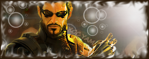
The render seems to have lost quality very noticeable on the face
The border is very distracting
Also doesn't blend well with the background
Light source is waaay too strong taking up the entire right side of the sig
I do like the text placement
The border is very distracting
Also doesn't blend well with the background
Light source is waaay too strong taking up the entire right side of the sig
I do like the text placement
I like the text. I agree with sakira and I would try to make the light source a golden color that matches with the shine on his right side. I like the border its a cool looking effect just not on this sig. I would keep the boarder more simple on this one.I hope this cnc helps.
im not really sure what alls going on but i Like the text
try blending the c4d lookin thing to the background
try blending the c4d lookin thing to the background

Im Back! and i will start back on the test images nice round there out since this week is over
Last edited:
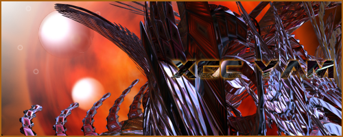
here is an experiment.
Can anyone cnc this for me?
You show a good grasp of a few techniques here. The text is nice however needs a little sharpening to give it more edge.
Colours are okay. A gradient map over it all would probably make them blend a bit better though.
As far as abstract sigs go, its okay but not great. It seems a bit random (the detail of the c4d may be to blame here) and the c4d looks mainly pasted on (the border is the only thing really tying it together right now).
It's a good attempt as some artists don't go near doing stuff without a 'proper' focal.

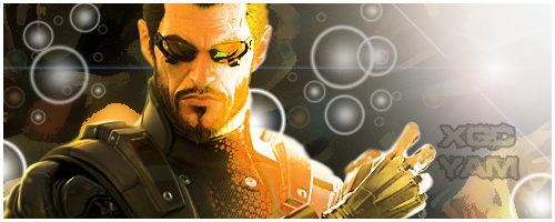
The render is a little crowded and is hidden behind the bubbles. Another thing, there isn't enough effects so it's just a red background with bubbles. Add a star stock and look at some tut's that can show you how to make a blend sig and some natural created effects without importing effects. When I say this I mean opacity settings.
P.S.: The text is hard to see. Try and making it a color that stands out then bring the opacity down.
P.S.: The text is hard to see. Try and making it a color that stands out then bring the opacity down.
- Status
- Not open for further replies.