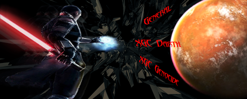
Okay, let's try this one.
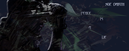
I personally feel that you are depending too heavily on C4D's and not putting enough effort on making the signature an appealing image. I would suggest looking at the overall product and and asking yourself what could make it better. Let me show you with an example using your latest design, which in my opinion was a vast improvement. I hope that you don't mind that I drew on it a little bit.
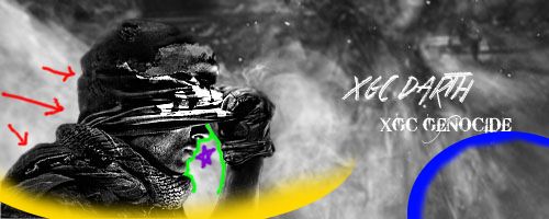
One of the most important ways to make an image appealing, and improve the flow, is by manipulating the contrast caused in certain spots. Now, the contrast should be greatest in the areas you want to draw our eyes, and more gradual where we don't need to look much. In the background you did a very good job with that, and placing the text. The only issue is that the entire render is a great contrast too the background. It looks like a render stuck onto a background. What I suggest is by decreasing the contrast in certain spots to make the image draw you in most at the face.
Represented by the red arrows is where the back of the render meets the background. This is a unimportant area, that isn't very interesting to look at, so it should be slightly blended into the background. I would suggest darkening the background in this area, and perhaps blending or blurring it a little more around the neck area. You might also darken just in front of the face, the purple star, to create a greater contrast where you want to draw us in. The area in between the face and the arm, the area outlined with green, is where I would want the eye to be drawn to. The hand already draws you in, and the top of the nose looks fine because its dark, but you need to think about how hard it is to focus where the contrast change is gradual.
Also, because the render already has such a clear area from where the light is you will want your background to have a slight change in where the lighting is shown from, rather than having it all bright. The area where I would place the light, shown by a blue section of a circle, is in the lower right hand corner. The best way I have found to do this is by making a layer and setting its mode to "Overlay" then making a white circle in the corner with a large brush size that is slightly off the image. Than you add some black to the far side of the image, moving out until you get the desired effect.
Another thing that might help, is add a little of a C4D onto the render. You must be sure not to add it over the entire render if you do though, or it will be hard to see. I would add a C4D on the bottom of the render, shown by yellow/orange curve, to give it a slight flow into the background.
Also, perhaps you might try playing with the size of your signature a bit. I find that I don't like how fat the 500x200 looks. I personally use 495x150, I think it has a better length to width ratio. You may not agree with that, and may find that you want to stay at 500x200, but I still encourage you to give it a try. I hope this helps you, but I think more than anything there are two things you need to remember.
First off: Have FUN with it. Don't feel like its a job, though it can be tedious, or you will stop being creative with the signatures.
Secondly: Don't lose your style. With us critiquing your work you may feel pressured to try and adapt your style to fit our styles, but you shouldn't do that. We're here to help you grow and prefect your style, not make you use ours. The variety of styles is what makes the XDC so great.